Creating the perfect email design: Techniques to ensure high conversion
[Creating the perfect email design: Techniques to ensure high conversion]
“A user interface is like a joke. If you have to explain it, it’s not that good.” –Martin LeBlanc
Making the best email is all about putting yourself into the user’s shoes. Think always about the user, like all good design pieces, then about the sell. First of all you should ask yourself: “Would I like to receive this piece of ad/information in my mailbox?”. It is not easy, I know, but we will give you some hints, to make the whole process a little easier.
Let`s start with some statistics that might interest you:
40% of users will abandon a page or email if it takes more than 3 seconds to load. So be cautious, optimize and compress your images correctly.
Only 55% of the companies do extensive user experience testing. Stay ahead, never forget about the user. Testing is the key to find what works best and what is less effective.
Almost 46% of users complain about having to interact with web pages, and also complained about navigation issues. These are clear signs of badly designed interfaces all over the web.
Now we get down to business, here are some valuable tips:
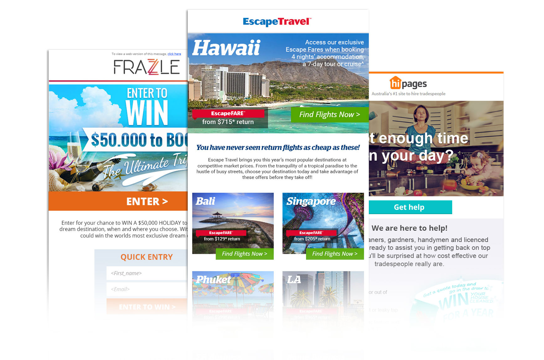
Try a one column layout. It is easier to guide the user through your message. Why distract the user to other less important points of the layout?
Try offering some kind of gift at first, instead of trying to close a deal too fast. This is an effective tactic that relies on reciprocity and helps you build more trust.
Instead of telling how awesome you are, use some social credibility. Other previous customer’s reviews and partner’s recommendations or testimonials work great for this purpose and reinforce your Call to Action effectiveness.
Have more than one Call to Action button. But don’t overdo it. Find the sweet spot (normally two).
Give some highlight and recommend something, instead of showing choices who have the same weight. That is why we always have a “hero” offer and other minor offers, not three equally important offers.
This one is pretty obvious for anyone with a Marketing background but is always good to remember: Pick your audience. Don’t try to sell to everybody.
Be direct. Don’t leave any room for doubts in your message. Most of all, you have to be sure of what you want to sell.
Use a contrasting color for your Call To Action buttons. Orange is one of the most effective, overall.
Give it a sense of flow. Be careful not look like the piece of advertising has ended, and out of nowhere it restarts. It frustrates the reader, who has a huge chance of closing the email.
It has got to be mobile responsive since day one. A design that is not planned to be responsive, will face many problems in the development stage.

Keep your focus, instead of inserting multiple CTAs in a short space. Focus on a well written piece of text and then present your button. This way you make sure that your user is well motivated to navigate further.
Your CTA’s text can do better if they indicate the benefit of clicking on it, instead of just showing a specific action. For example “Increase your revenue”, would be better than “Sign up today”, most of the times.
To make it lighter, try using less divisions and borders, this way you don’t waste the reader attention. Inserting too many distinct boxes can make it cluttered or out of alignment.
Instead of selling just features, try to sell benefits. People don’t want to know what kind of file you camera generates, this should be on the technical specs section, people want it to be fast, so they can save time and get the perfect picture.
Consistency is key to assure a good layout overall. Don’t mix different kind of shapes, unless it is really necessary. If most things follow one direction, don’t break the flow by changing it out of a sudden. Make it coherent among itself.
Don’t be afraid to follow some conventions. It is called common sense. Imagine opening a pop-up with the “close” button on the bottom left corner of it. It would be painful for the user to relearn where to close the window. Also, you wouldn’t start your piece of design by the main button, right? Instead, the company logo is the most comfortable and easy choice. For a reason.
Sometimes you can use the fear of losing something, instead of highlighting benefits only. “Don’t lose what is more precious to you” might be more powerful than “Win more of what you think is valuable”
Well this is most of it. Don’t make the user think too much, be simple and remember the old saying: less is more. Keep it short and straight forward, because people`s attention span on the web is getting shorter and shorter by the day. Of course, your sense and training for designing user interfaces and interesting user experience, play a major role in this equation. There is no magical formula, you will have to try and fail a lot, before hitting the spot. But rest assured, that by following these guidelines, you increase greatly your chances of making a killer email piece that is almost guaranteed to convert!
Good luck!
About the author
Yuri Santos
Graphic Designer
Almost a decade creating interfaces for all kind of clients, from small start-ups to big multi-nationals, always focusing on the best practices to ensure maximum conversion and effectiveness for marketing campaigns.

Related posts
Does email marketing belong to the past, or have we only scratched on the surface what this ‘old fashion’ sales channel can do? Well, fact is that its position on the Iron Throne of the ROI Kingdoms has been unchallenged for many years, and the trend is not changing. In fact, we see the opposite […]
When working with bloggers you come across many great writers, passionate and dedicated to their cause of producing great content for their subscribers. After all this is the reason they started their blog. Share the passion and show/teach others what is most valuable to them, and closest to their hearts. Unfortunately most bloggers are not […]
Content is King Chances are you’re familiar with the term ‘content marketing’. In fact you’ve probably been reminded many times by overzealous marketers that “content is king”. The consensus you’ve reached is that you absolutely must be doing content marketing. But what is it exactly? Content marketing basically involves creating valuable content for your target […]